Theme settings let you style your Userflow content to match your brand. You can create themes manually with full control over every setting, or use the AI Theme Creator to automatically generate a theme based on your site.
Creating a theme
You have two options when creating a new theme:
AI Theme Creator: Generate themes instantly from your brand assets
Manually: Customize every detail yourself
Option 1: Auto-generate a theme with AI
Let AI do the heavy lifting by analyzing your website and automatically configuring your theme settings.
Navigate to Settings > Themes from the sidebar.
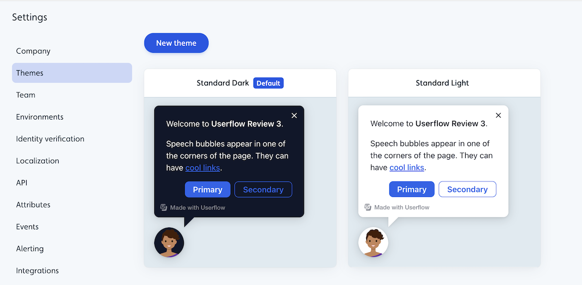
Click New theme.
Select Auto-generate theme.
Enter a theme Name.
Provide your Website URL (the site you want to match).
Click Auto-generate theme. The theme will auto-generate and appear in alphabetical order if you have multiple themes. An email confirmation will be sent once the theme is generated.
Select the theme once created to review/update its settings.
What gets configured automatically:
Base colors (headers, backgrounds, text, accents).
Typography (font families and sizing).
Element styles (buttons, modals, tooltips, speech bubbles, announcement blocks, launchers).
Chrome border radius and backdrop behaviors.
Other Brand Assets
Brand assets such as logos need to be uploaded manually after theme creation.
Option 2: Manually creating a theme
Select Settings > Themes from the sidebar.
Click New theme or select an existing standard theme.
To edit an existing standard theme, select it to view its details and then click Duplicate theme.
.png)
Enter a theme Name and click Create theme.
Configure your settings (see sections below).
Common theme settings
Whether you auto-generate a theme or create one manually, you have full control over theme settings.
Base colors
Base colors define the foundational color palette for your Userflow content.
Header color: The color of headers and titles.
Background color: The main background color for content containers.
Text color: The default color for body text.
Link color: The color for clickable links.
Primary color: Your main brand accent color.
Secondary color: A complementary accent color.
Typography
Control the fonts used throughout your Userflow content.
Font family: Choose from web-safe fonts or add custom fonts.
Font sizes: Set sizing for headers, body text, and UI elements.
Font weights: Define regular, medium, and bold weights.
Chrome settings
Chrome settings control the overall appearance of your content containers.
Border radius: Adjust corner rounding (0 for sharp corners, higher values for rounded).
Shadow: Add or remove drop shadows.
Backdrop: Configure backdrop dimming and blur effects.
Element styles
Customize individual UI components.
Buttons
Primary button (background, text color, border, hover states)
Secondary button styles
Border radius and padding
Speech bubbles
Background text colors
Border and shadow
Arrow positioning and styling
Modals
Container styling
Header and content areas
Close button appearance
Announcement blocks
Container styles
Title and content formatting
Dismiss button appearance
Launchers
Icon and background colors
Positioning and sizing
Hover and active states
Adding conditional variations to a theme
Create dynamic theme variations that automatically adapt based on user attributes, company data, or the current page URL. This allows a single theme to serve multiple contexts without creating separate themes for each scenario.
How conditional variations work
Conditional variations override specific theme settings when certain conditions are met. The base theme remains unchanged, but targeted elements adjust automatically based on your defined rules.
Common use cases:
Dark and light modes: Automatically switch color schemes based on a user’s display preference.
Responsive adjustments: Modify sizing, spacing, or layout for mobile devices.
Personalization: Display user-specific avatars, colors, or branding elements.
White-label support: Apply different color schemes for different clients or subdomains.
Role-based styling: Adjust visual hierarchy based on user role or permission level.
Setting up conditional variations
Open your theme in Settings > Themes.
Select Add conditional variation, then Add condition.
.png)
Enter a name for these settings (Replace “Give your variation a name.”)
Define your conditions and click Apply changes.
Click Save theme. Settings overwritten by the conditional variation will be labeled in purple within the theme. Example:
.png)
Custom CSS and buttons
For advanced styling beyond the standard theme options, you can add custom CSS to create unique designs and components that aren’t available through the visual theme editor. Try the standard theme options first. Custom CSS should be a last resort when visual customization isn’t achievable through the built-in controls.
Adding custom CSS to your theme
Open your theme settings in Settings > Themes.
Scroll to the Custom CSS option and click to expand it.
Select Edit custom CSS.
Write your CSS rules for container and/or button styles and click Done.
.png)
Click Save theme.
Managing themes
Editing a theme
Navigate to Settings > Themes from the sidebar.
Select the theme you want to edit.
Make your changes.
Click Save.
Changes apply immediately to all content using that theme.
Duplicating a theme
To create a variation of an existing theme:
Navigate to Settings > Themes from the sidebar.
Select the theme you want to duplicate.
Click the three-dot menu and select Duplicate theme.
.png)
Enter a name for the new theme and click Create theme.
Make changes to customize the theme and click Save theme.
Deleting a theme
Navigate to Settings > Themes from the sidebar.
Select the theme you want to delete.
Click the three-dot menu and select Delete theme.
.png)
Confirm you want to delete when prompted.
Click Discard changes if prompted to confirm you want to delete unsaved changes.
Deleting themes in use
You cannot delete a theme that’s currently in use. Reassign content to a different theme first.
Setting a default theme
Navigate to Settings > Themes.
Select the theme you want to make the default.
Click the three-dot menu and select Set as company default. New content will automatically use the default theme.
.png)
Applying themes to content
When creating new content
Select your theme from the Theme dropdown in the content builder.
.png)
Changing a theme on existing content
Open the builder for your Flow, Checklist, or other content.
From the Builder tab, expand Show advanced settings in the left-hand panel.
Select a different theme from the Theme dropdown.
Theme tips for best results
For AI-generated themes
Use your main website URL for the most accurate brand match.
Review and refine settings after generation.
Test your theme with real content to ensure it renders correctly in context.
For manually created themes
Start with base colors and typography before customizing individual elements.
Use your brand guidelines to ensure consistency.
Create variations (light/dark, formal/casual) for different use cases.
Preview themes across different content types before finalizing.
General best practices
Maintain sufficient color contrast for accessibility.
Limit your palette to 2-3 primary colors for visual consistency.
Test themes on different screen sizes.
Keep button and modal styling consistent across all elements.
FAQ
Can I edit an AI-generated theme?
Yes. Once generated, your theme works exactly like a manually created theme - you can edit any setting.
How long does AI theme generation take?
Processing time varies depending on your website’s complexity.
What happens if I delete a theme that’s in use?
You cannot delete a theme currently applied to content. First, reassign that content to a different theme.
Can I export/import themes between accounts?
Not currently. You’ll need to recreate themes manually or use the AI Theme Creator in each account.
Theme settings
You can modify the appearance and style of your Userflow content through themes by changing aspects like colors, fonts, content size and dimensions, content placement, launchers, and more. All of this can be done without any coding. Below is a list of the different theme options and how you can utilize them:
Option | Description |
|---|---|
Base colors | You can use the base color theme settings to change the colors of headers, buttons, background, and text for all content (speech bubbles, tooltips, modals, launchers, etc.). Note that the base colors can also be overwritten in the more focused theme settings. |
Font | You can use the font theme settings to change the font color, font family, font size, font height, and font weight. |
Chrome border radius | You can use the Chrome border radius theme setting to change the border radius of modals, tooltips, and speech bubbles. |
X-button | You can use the X-button theme settings to change the color of the X-button for flows and checklists, as well as to modify its behavior. For example, you can determine whether it should display an exit menu with options to resume, close, or restart, or if it should simply dismiss the flow. |
Avatar type | You can use the avatar type theme setting to change the avatar on modals and speech bubbles to be a cartoon character, a custom image upload/url, or not to use an avatar at all. |
Buttons | You can use the button theme settings to change the height, width, border radius, color (base, on click, and on hover), and alignment (left, right, center) of buttons inside modals, tooltips, and speech bubbles. One can have different settings for primary and secondary buttons, respectively. |
Speech bubble | You can use the speech bubble theme settings to change the width and position of the speech bubbles in a flow. You can position the speech bubble to be in the bottom left, bottom right, bottom center, top left, top right, or top center. You can also adjust the offset. |
Tooltip | You can use the tooltip theme settings to adjust the width and notch size of tooltips in a flow or launcher. As well as the Missing tooltip target tolerance (time to wait before missing tooltip target behavior) and the Missing tooltip target behavior (whether to auto-dismiss, show warning, or use speech bubble). |
Modal | You cannot change the position of the modal, but you can use the modal theme settings to change the width and padding of modals in flows. Modals by default have a backdrop, and with these theme settings, you can also adjust the modal backdrop behavior to either block clicks or dismiss the flow. |
Resource center launcher | You can use the Resource Center theme settings to adjust the width, z-index, and position of the Resource Center. You can position the resource center in the bottom left, bottom right, top left, or top right. You can also toggle whether you want to use manually inserted divider lines instead of the default auto-inserted ones. Finally, note that the colors of the resource center can be changed via the base color theme settings. |
Checklist | You can use the checklist theme settings to change the colors, width, z-index, and position of the checklist. You can position the checklist in the bottom left, bottom right, bottom center, top left, top right, or top center. You can also change the decoration of completed tasks to either have a line-through or nothing. |
Checklist launcher | You can use the checklist launcher theme settings to change the colors (base, on click, and on hover), width, z-index, and position of the checklist launcher. You can position the checklist launcher in the bottom left, bottom right, bottom center, top left, top right, or top center. Note that if you are using the resource center to display the active checklist, these settings are overridden by the resource center launcher theme settings. |
Progress bar | The progress bar is shown on flows as they progress through each step. You can choose from different types of progress bars and use the theme settings to adjust the color, height, and position (top or bottom) of the progress bar. |
Beacons | You can use the beacon theme settings to change the color of beacons for flows and launchers. |
Launcher icons | You can use the launcher icon theme settings to change the icon size, colors, and opacity for launcher icons. |
Launcher buttons | You can use the launcher button theme settings to change the colors (base, on click, and on hover), height, width, border radius, and border size for launcher buttons. |
Backdrop | The backdrop is what is shown to block clicks and better highlight either a modal or a tooltip target. You can use the backdrop theme settings to change the backdrop color, opacity, highlight type, highlight radius, highlight spread, highlight color, and highlight opacity. |
Focus highlight | The focus highlight is shown on buttons for accessibility reasons. You can use the focus highlight theme settings to change the color and opacity of the focus highlight. |
Voice-over | You can use the voice-over theme settings to change the voice type for voice-over to either be synthetic, manual, or not have voice-over at all. |
Interaction with other chat providers | You can use this theme setting to hide chat providers while a speech bubble is active (e.g., Intercom, Hubspot, Crisp). This is great in cases where a speech bubble overlaps with the chat provider. |
By default, Modals show a backdrop — the dimmed overlay behind the content that focuses attention on the step. This is on automatically for modal steps; you don't need to enable anything.
For tooltips and speech bubbles, there is no backdrop by default. If you want one on a specific step, turn on the Add backdrop switch in that step's settings — it's set per step, not globally for the theme.