A Flow is an interactive, engaging experience that guides users along designated paths in your application, helping them understand features, complete tasks, or navigate procedures. This guide explains the essential building blocks of creating an effective Flow - steps. While you develop, consider your intended audience, what you want your users to accomplish, and how and when you want to present it.
Use this guide to understand the fundamental building blocks and strategy forcreating engaging Flow experiences.
This guide applies to building Flows from scratch, not Smartflows. Refer to Creating AI-generated Smartflows to learn more.
.png)
Prerequisites
Install the Chrome extension to preview before you publish.
Install Userflow.js to publish Flows.
Accessing the Flow builder
Before you get started, think about who your target audience is, what the flow should help them know or do, and when they should be presented with the flow. Preparing these simple guidelines will help you focus the flow’s direction, content, and outcome.
Select Flows in the sidebar
Click Create flow
Select Start from scratch.
Enter a flow name and click Create.
Options for starting a Flow
A flow can start automatically based on specific conditions, or you can allow a user to start a flow through an action, such as clicking a button or link.
See the Starting flows/checklists guide for more information.
Select a step type
Each step in your flow needs a step type, which controls where and how content appears to users in the flow. Mix and match different step types within a flow to create the experience you want. The default step type is the Speech bubble. To change it, click the gear icon ⚙️ in any step to select a different type and adjust its settings.
.png)
Step types
Step Type | Description | Best For |
|---|---|---|
Speech bubble | Appears in a specific location in your app (configured in themes), but is not anchored to a specific element. | Great for starting a Flow with a conversational, action-oriented tone. |
Tooltip | Anchors tips and prompts directly to elements within your application. | Ideal for guiding users through specific processes. |
Modal | A message that appears on top of your app’s main content, temporarily disabling interaction with the underlying page until it is dismissed or the user progresses to the next step. | Excellent for one-step announcements, prompting a user to start a Flow, or ending a Flow with a congratulatory message. (Users love the confetti you can add!) |
Hidden | Provides a user interaction that triggers subsequent steps without displaying a visible interface. (Learn more.) | Often used to pause the interface until a user completes an action or to automatically navigate users to a specific page. |
Speech bubble
.png)
Tooltip
.png)
Modal
.png)
Hidden
.png)
Customize and enhance your steps
Once you choose a step type, you can then customize it to enhance engagement. Click the gear icon ⚙️ in the step to customize it.
Tooltip element selection and configuration
Once you add a tooltip step, you must select the element in your app to which you want to anchor the tooltip.
Help with Element Selection
In addition to the brief descriptions below, refer to the Selecting elements article for more detailed instructions.
Element selection
Automatic element selector
One of Userflow's key strengths is its user-friendly and robust automatic element selector. Instead of displaying raw CSS, it shows an image of your selected element and uses multiple data points to ensure reliable element selection.
Advanced options include:
Dynamic text - Allows Userflow to find target elements even when text changes for each user
Strictness - Lets you adjust how strictly Userflow should identify the correct element (Loose or Strict)
Manual Element Selection
While we recommend using the automatic selector, you can also select elements manually by clicking Go Manual. This allows you to find elements based on either text or CSS data.
Element Not Found
If Userflow cannot find a selected element, it may be due to an iframe conflict, multiple elements sharing the same CSS ID, or an element in your app taking too long to load, which causes the flow to time out. See Element not found to learn how to select an element when it is not found.
Tooltip Positioning
To control tooltip position (left, right, above, or below the target element):
Click on the selected element in the flow step builder
Select Specify tooltip position
Spacing & tooltip display
Tooltips require sufficient UI space and may display in alternative positions if the specified position lacks adequate space.
Step Triggers
Use triggers to establish "if this, then that" guidelines to manage steps or execute actions based on different conditions. This enables the creation of more complex and advanced workflows. You can incorporate several triggers into a single step for creating branching workflows, bypassing steps, and more.
To add a trigger, click Add block > Trigger on a step. Trigger conditions include:
Attribute: Trigger based on specific user attributes
Current page (URL): Trigger when the user reaches a certain page
Element is present/clicked/disabled: Trigger based on UI element state (great for handling long load times)
Text input value: Trigger when an input field contains a specific value
User fills in input: Trigger when a user fills in an input field with any value
Current time: Trigger at specific times or during time periods
Water is wet: Always true condition (triggers regardless of other factors)
Logic group: and, or logic
Wait: Add the number of seconds before continuing
Best Practice: Add triggers to non-hidden steps to prevent users from getting stuck.
Triggers & Event Conditions
Custom event conditions aren’t currently supported in Triggers. As a workaround, update a user attribute instead of sending an event.
Apply actions to step triggers
For each flow step, you can add buttons, tooltip targets, and step triggers. .png)
When these elements are activated, you can specify actions to occur:
Go to step - Navigate to a specified flow step
Track event - Apply an event tracker to a button (select an event tracker from the list once this option is chosen)
Dismiss - End the current flow
Start new flow/checklist - Begin a different flow/checklist (auto-dismisses the current flow)
Navigate to page - Direct users to a specific URL (same tab or new tab)
Snooze flow - Pause the flow for a specified duration (Learn more)
Set user attribute - Define attribute values (can include incrementing numeric values)
Evaluate JavaScript - Execute JavaScript code to trigger actions in your application
Flow Management
Determine the flow of action (how users move from step to step)
Figuring out how to move from one step to the next is key to building an interactive Flow. You must decide whether the user completes the step by interacting with the Flow element itself (e.g., a button) or by performing an action in your product. Be careful of building “Next-Next-Next” Flows, as the lack of interaction can lead to user disinterest. Try to build an active path for users to engage in.
Use Flow best practices to build your flow and drive engaging experiences.
Learn more about adding and deleting steps.
Temporarily Hiding Flows
To display flows only on certain pages after they've started, enable Temporarily hide flow if in the flow's advanced settings. This conceals the flow when conditions are met and allows other flows to start.
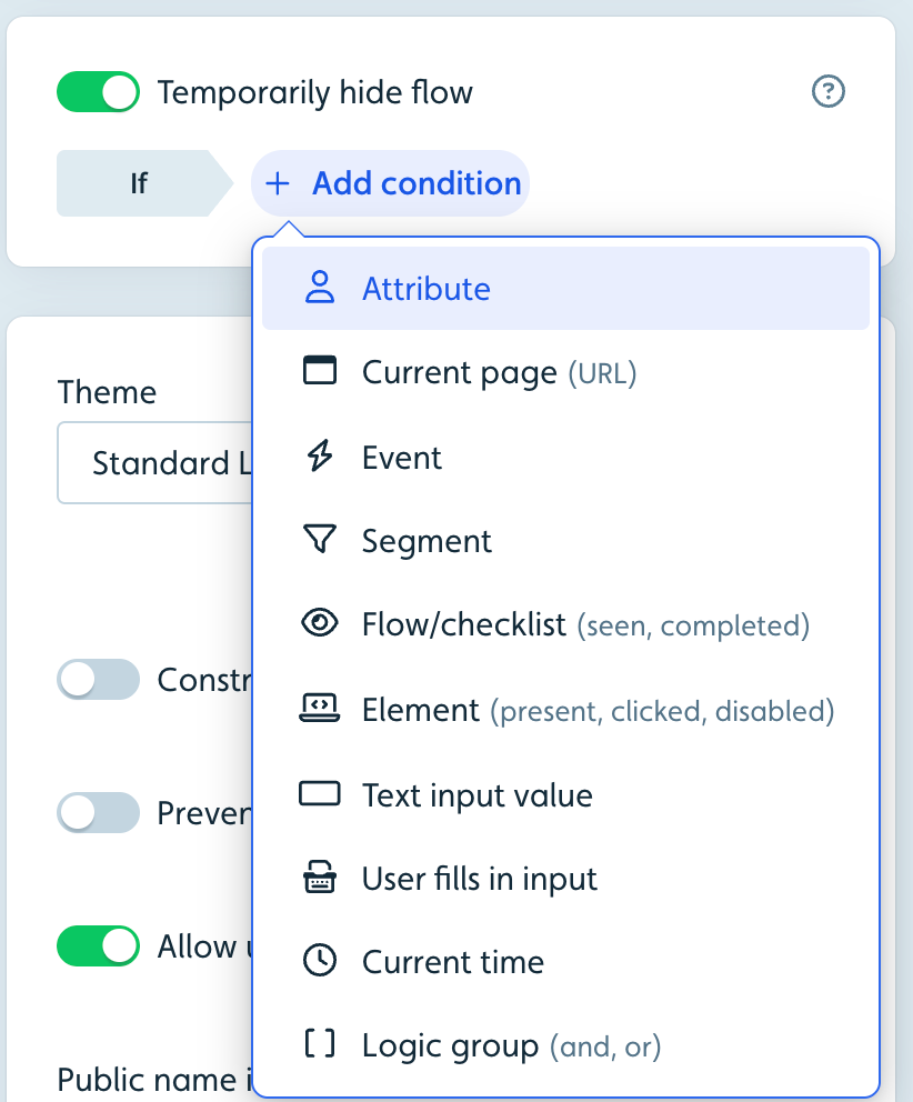
Important: Best practice is to use auto-start conditions to control who sees a flow and when, rather than relying on the temporary hide condition.
Using Backdrops
Backdrops provide a powerful way to focus user attention by adding a semi-transparent layer over your application. This layer covers everything except Userflow content and tooltip target elements, blocking clicks on background elements to guide user actions.
Modal steps include backdrops by default
For tooltip and speech bubble steps, you can toggle backdrops on per step
Backdrop behavior and appearance can be adjusted in theme settings
Ending Flows
Dismissing a Flow
Users can dismiss flows at any time via the X-button in the top corner of modals, speech bubbles, and tooltips. While you can disable this button in advanced settings, we generally don't recommend it.
You can also add Dismiss actions to buttons, tooltip target clicks, survey questions, and step triggers.
Best Practice: Always add a dismiss action on the last step to provide a clear call-to-action.
Dismiss actions
When using Start a flow actions, the current flow automatically dismisses the Flow. Other actions such as Navigate to page require explicit dismiss actions.
Important: Ensure flows eventually dismiss or hide to prevent blocking other flows from starting.
Completing a Flow
Flow completion differs from dismissal. A flow is considered complete when users reach a completion step. By default, the last step is the completion step, but you can designate any step as an Explicit completion step in the builder.
For conditional completion:
If you want a flow to complete only when users click a specific button, add a hidden step after that button
Configure this hidden step with an "always true" trigger (Water is wet) and a dismiss action
Customizing X-Button Behavior
By default, clicking the X-button dismisses a flow or checklist. You can modify this behavior in theme settings to display an exit menu with options to resume, close (dismiss), or restart the flow.
Note
This exit menu appears only on steps beyond the first step.
Adding confetti feedback
Do you want to add some delight to your onboarding tours? Try adding confetti!
Driving engagement and enthusiasm in your flows depends on keeping the user’s interest and providing feedback and rewards. Help your users celebrate their successes with a fun confetti animation.
.png)
Confetti can be added to new and existing modals, tooltips, and speech bubbles in any flow. To add confetti, use the toggle switch to activate the Add confetti option.
A visual depiction of confetti will appear behind the modal, tooltip, or speech bubble in the builder to indicate that it is on for that step.