Dashboards provide a powerful way to visualize and monitor your most important metrics in one centralized view. Instead of navigating through multiple pre-built reports or exporting data to external tools, you can create custom dashboards tailored to your specific needs. Whether you're tracking product adoption, monitoring user engagement, or preparing insights for internal review, dashboards let you arrange charts and data visualizations exactly as you want. With drag-and-drop functionality, flexible filtering options, and the ability to use existing charts or create new ones on the fly, you'll be able to build meaningful views that tell your data story effectively and help drive better business decisions.
Dashboards are part of Userflow's Product Adoption Insights suite. Combine dashboards with Chart Builder, Funnel Analysis, and No-code Event Tracking to build a complete analytics layer directly inside Userflow.
Creating and managing a dashboard
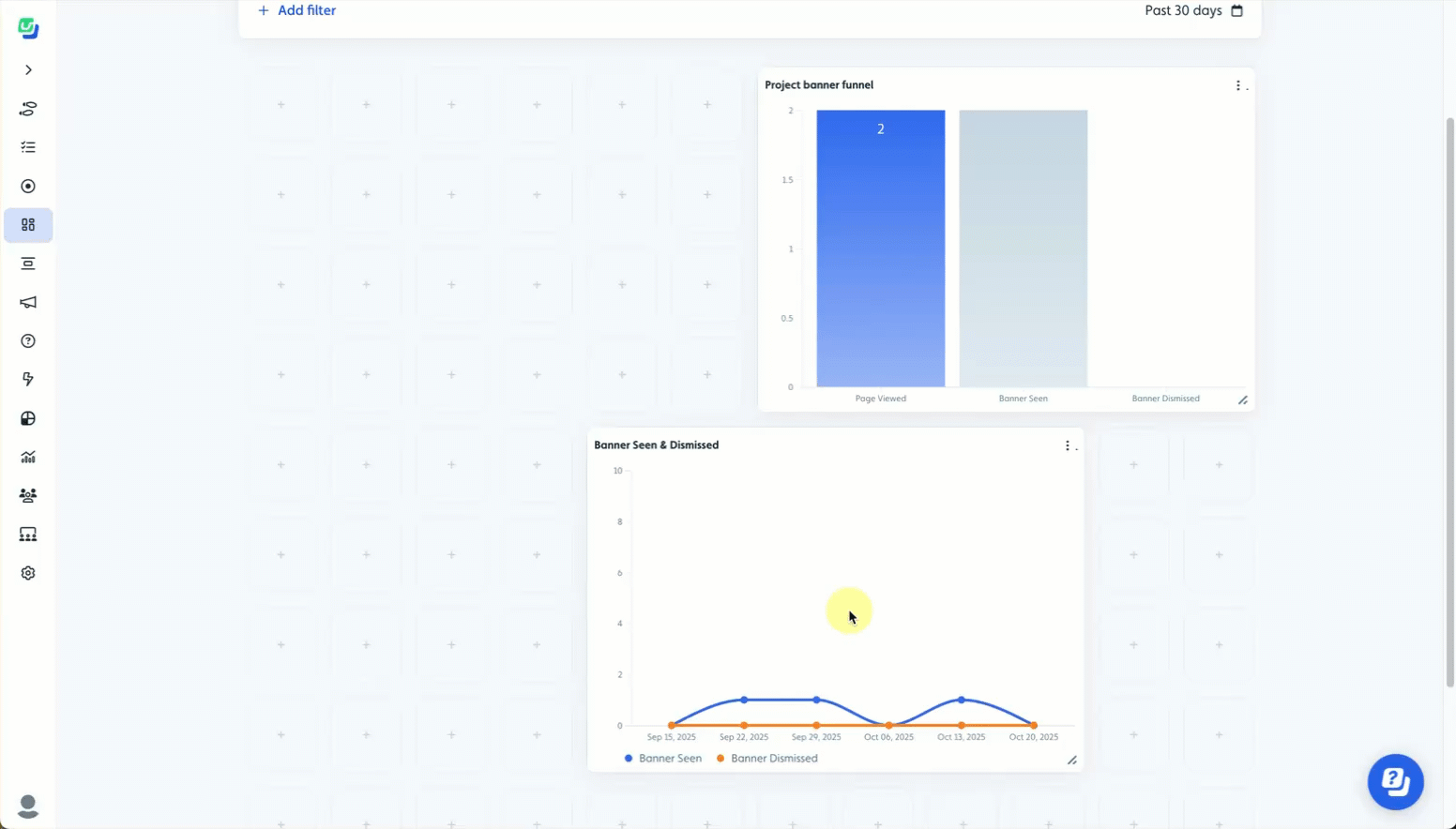
Once you create a dashboard, you have full flexibility to add charts, manage their placement, and resize each for clarity and emphasis.
Adding a chart
Click Add chart or click a "+" in the location where you want to add a chart on the dashboard.
.png) or
or .png)
Select the chart from the list or click Create new chart.
.png)
If you choose to create a new chart, you must save any current changes first. If you have unsaved changes, you will receive the following prompt. Either click Cancel and save your changes before proceeding, or click Discard changes to proceed without saving..png)
Click Save to save your changes in the dashboard.
.png)
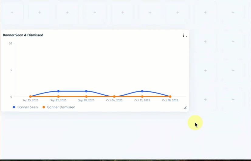
Resizing a chart
Charts in the dashboard can be easily resized using the resizing handle. Select the handle and drag the window to the desired size.
Moving a chart
You can move charts to different locations within the dashboard to customize the experience, give prominence to particular data, or ensure related charts are close to each other. Simply click and drag a chart to the desired location.
If the chart doesn't fit into the location it's dragged to, it will be placed in the closest area where it fits.
The chart will "snap" to the grid to align properly.
Deleting a chart
To delete a chart from a dashboard, click the "three dots" on a chart and select Remove..png)
Sharing a dashboard or chart
You can share charts or dashboards with others who have access to Userflow.
You must be in edit mode to share a chart or dashboard.
To share a chart, click the "three dots" on a chart and select Copy link to chart. Paste the link into an email or your messaging app.
.png)
To share a dashboard, you must first save all changes. Then, click the "three dots" in the upper right of the dashboard and select Share dashboard link. Paste the link into an email or your messaging app.
.png)
Adding Dashboard filters
You can apply attribute filters to a dashboard to view chart data for specific attributes, allowing you to focus on exactly the information that matters most for your analysis. Dashboard filters dynamically update all charts and visualizations to show only the filtered subset of data, enabling you to instantly switch between different views, without creating separate reports. This interactivity makes it easy to compare scenarios, drill down from high-level overviews to granular details, answer specific business questions on the fly, and create custom views for different stakeholders without modifying the underlying dashboard structure.
Applying vs. Saving Filters
You can use filters on a dashboard without saving them by applying them while viewing an existing dashboard. If you wish for the filters to be retained with the dashboard (meaning the data will be filtered by default during viewing), you need to be in edit mode when you apply the filters and then save the dashboard with those filters in place.
To add or modify filters:
Click Add filter at the top of the dashboard and select Attribute.
.png)
Select an attribute from the list or create a new attribute.
.png)
Add additional filters and logic groups to customize the data.
If applying filters while in edit mode, click Save to retain the filters with the dashboard.
.png)
Selecting a date range
The default time period applied to a dashboard is 30 days. To view data for a specific time period, use the date range selector..png)
Applying vs. Saving Date Ranges
You can set a date range on a dashboard without saving it by applying it while viewing an existing dashboard. If you wish for the date range to be retained with the dashboard (meaning the data will reflect the date range by default during viewing), you need to be in edit mode when you apply the date range and then save the dashboard with that date range in place.