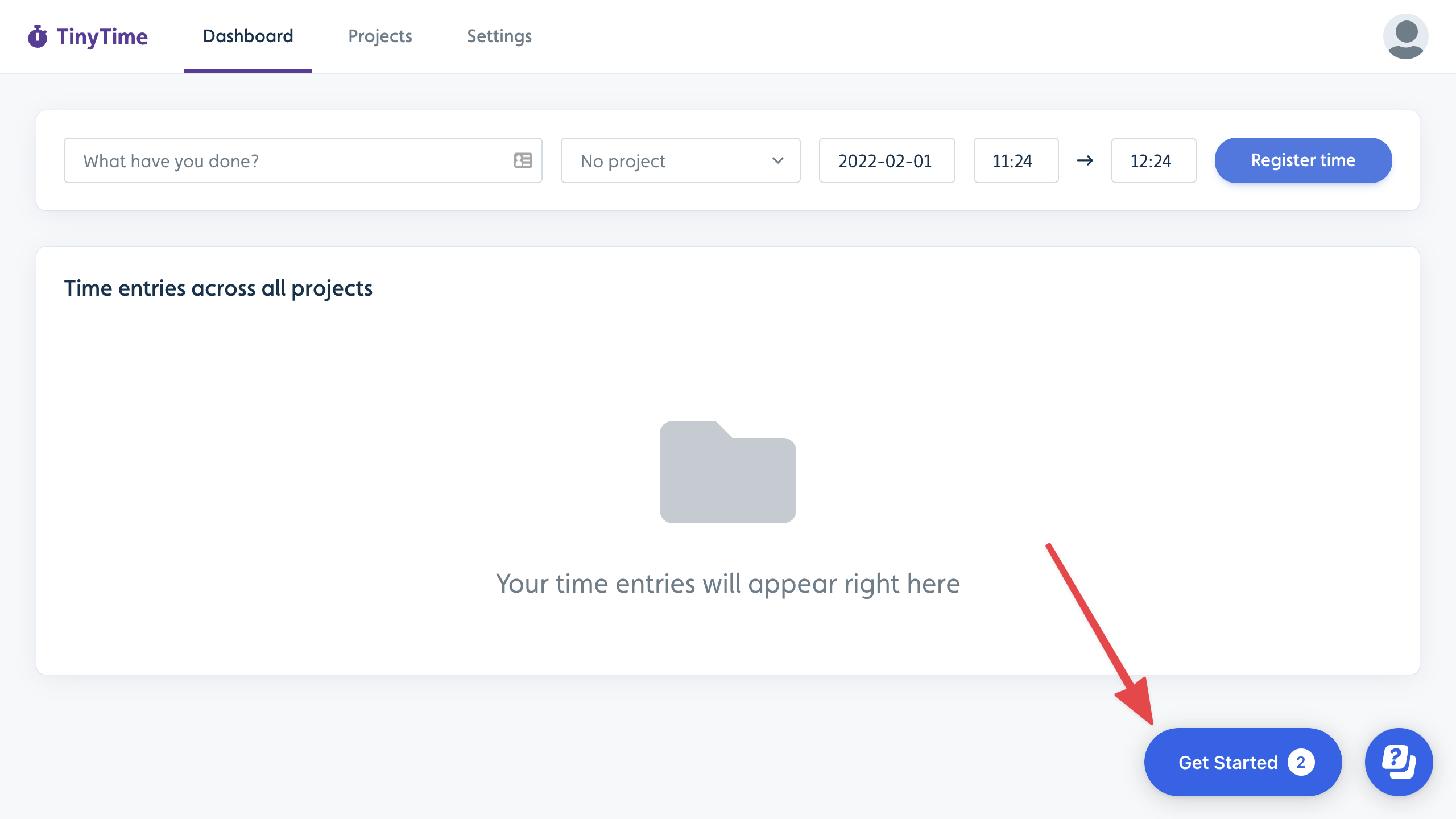
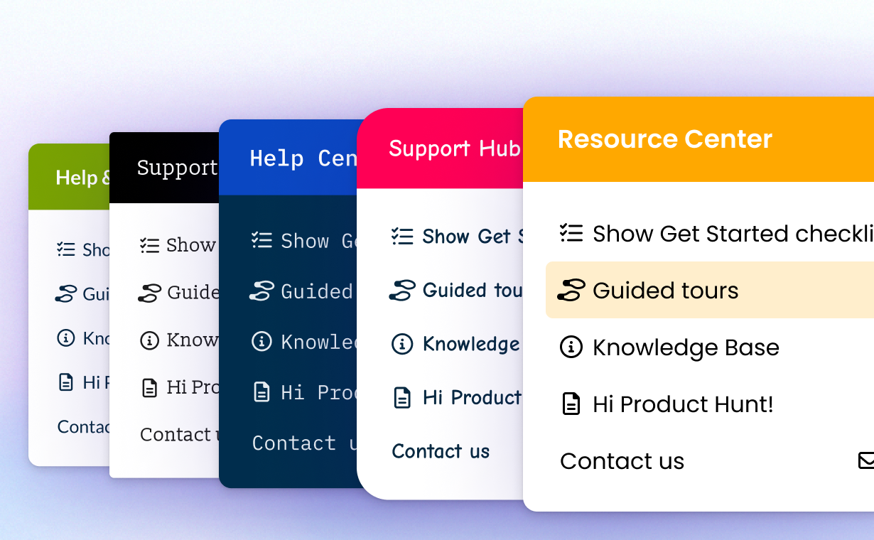
The Resource Center is an always-on, contextual, and personalized help widget that empowers your users to find help directly within your app, ensuring that assistance is readily available whenever they need it. This innovative tool is designed to seamlessly blend into the user experience, offering customized assistance pertinent to the user. By providing immediate access to helpful resources, the widget enhances user satisfaction and engagement, enabling individuals to resolve issues efficiently without leaving their current tasks.
How the Resource Center works
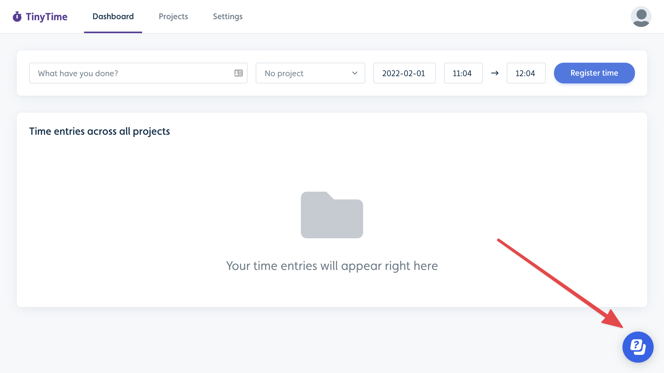
We provide a default button in the lower-right corner of your app to launch the Resource Center; however, you can customize the user experience by using an element (e.g., a button, icon, or menu item) in your app to trigger the Resource Center instead of the default button or programmatically control so it appears without a visible trigger (e.g., it appears when specified conditions are met). When you build a Resource Center, add the content blocks that best meet your users’ needs.
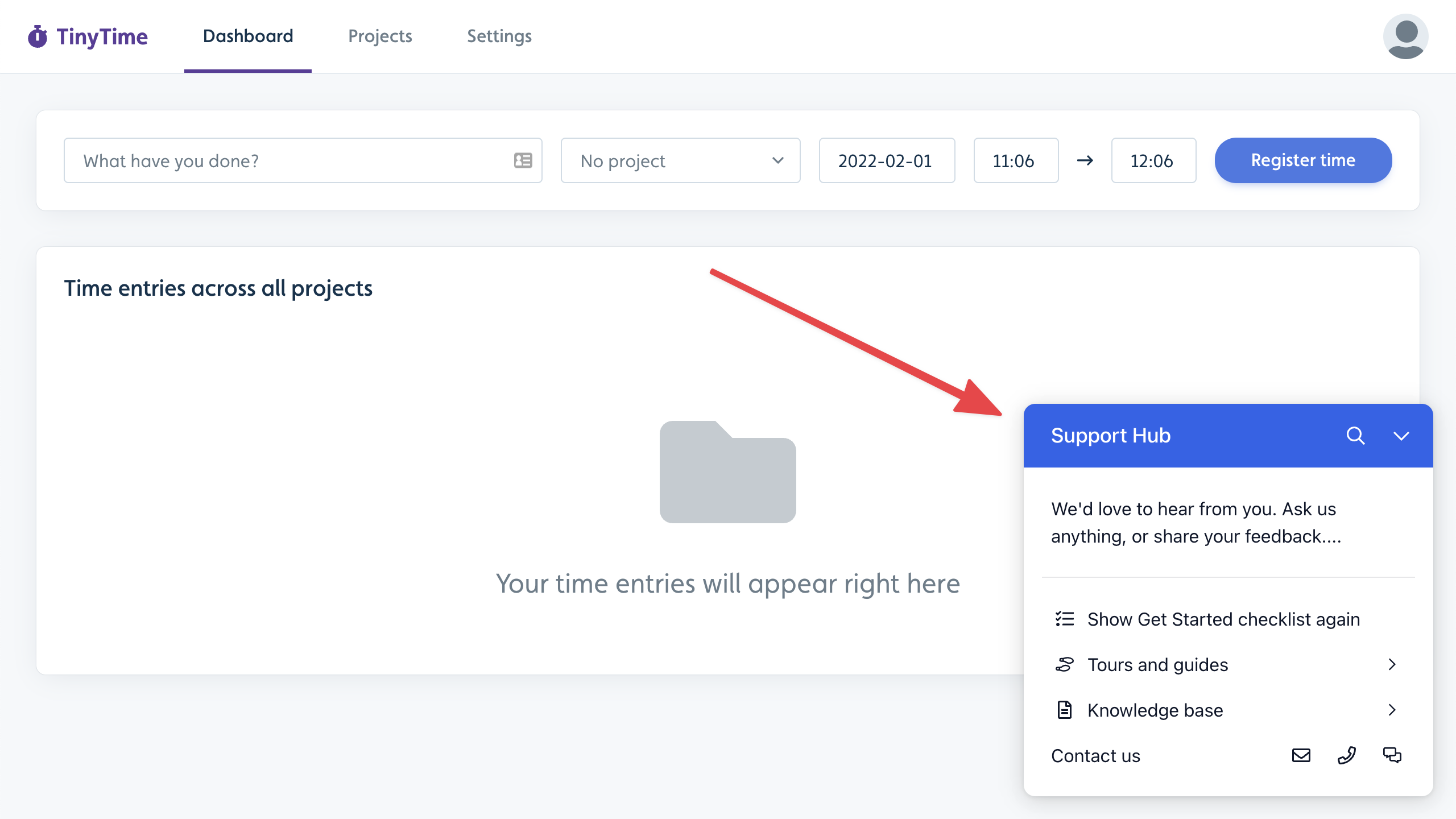
When users click the button or app element, it expands to a list of customizable blocks, including free-form messages, links to flows, checklists, support contacts, announcements, Adoption Agent knowledge base search, and more.
Creating a Resource Center
Select Resource centers in the sidebar.
Click Create resource center.
Enter a name and click Create resource center.
.png)
Customize how your Resource Center is Launched
By default, the Resource Center places a subtle help icon in the lower-right corner of your app. Alternatively, you can use an element in your app, such as a button, icon, or menu item, to trigger the Resource Center in a way that seamlessly integrates with your product experience.
When you add or edit a Resource Center, choose one of the following Launcher types: .png)
Default: Places a default help button in the lower-right corner of your app.
.png)
Custom: Choose an element in your app that, when clicked, will open the Resource Center. Follow the instructions below to select an element.
None: Userflow will not determine how your Resource Center is launched, and there will be no visible activation for the Resource Center. Use this option to control your Resource Center programmatically via Userflow.js.
Choosing a Resource Center Launcher type
Selecting the appropriate launcher type depends on how you want to integrate the Resource Center into your application. Use these recommendations to identify the most suitable option for your app and desired user experience.
Default Launcher | |
|---|---|
Behavior | Places a standard Userflow help button in the lower-right corner of your app (configurable in Theme settings). |
Best For | Teams looking for a “plug-and-play” solution that requires zero coding or custom design. It ensures high visibility for your content with minimal setup. |
Unread Count/Badge | Visible (on the button) The red notification badge appears directly on the button. |
Boosted Announcement Style (Pop-out) | Tethered to the Resource Center (with notch) Will appear next to the button, with a visual notch (arrow) pointing toward it, indicating the announcement's source. |
Example | You want a standard floating help button in the bottom-right corner of your app that works immediately upon installation. |
Custom Launcher | |
|---|---|
Behavior | You can select an existing element in your app that, when clicked, will open the Resource Center. |
Best For | Seamless integration where you want the help experience to feel like a native part of your app’s navigation rather than an overlay. |
Unread Count/Badge | Visible (On Element) The notification badge is attached to the corner of your custom element. |
Boosted Announcement Style (Pop-out) | Tethered to the Resource Center (with notch) They will appear next to the element with a visible notch (arrow) pointing toward it, indicating the announcement's source. |
Example | You want to anchor the Resource Center to an existing help link in your applications navigation bar or sidebar menu, rather than having a separate floating button. |
No Launcher (None) | |
|---|---|
Behavior | Userflow will not render a launcher button. This is typically used if you want to open the Resource Center exclusively via a custom button using userflow.toggleResourceCenter(), or if you intend to control the launcher’s visibility programmatically. |
Best For | Advanced use cases that require full programmatic control over when and how the Resource Center appears. |
Unread Count/Badge | Hidden |
Boosted Announcement Style (Pop-out) | Floating (no notch) Because there is no visible anchor target, they will appear on the screen (based on the Resource Center settings) without a notch. |
Example | You want to trigger the Resource Center only for a set of paid users who navigate to a specific page and click a button. |
Boosted Announcements & Custom Resource Center Launchers
Boosted Announcements will behave consistently, whether or not you use a custom launcher, no launch trigger, or the Userflow default. If you choose a custom element in your app, Boosted Announcements will appear with that element. If you select None as the launcher type, Boosted Announcements will appear in the default position of the Resource Center. Ensure Boosted Announcements don’t interfere with other elements of your app when you customize the launcher experience.
Selecting a custom element to launch the Resource Center
Select the Custom launcher type.
.png)
Click Select element.
Enter your app URL and click Select element.
.png)
Using the ‘Go Manual’ selection option
If an element requires entering its CSS, unique ID, or custom data attribute, use the Go Manual option to select it. Learn more.
Locate and select the element you want to use as the Resource Center launcher.
Navigating to the element: If you need to navigate to another page in your app to locate the element, click Navigate to another page in the element selection bar to pause recording your selection until you locate the element. When you are ready to select it, click Select element here and then select the element. To move the bar up or down on the screen (if it blocks the element you’re trying to select), use the up or down arrow..png)
Configure your Resource Center blocks as needed and publish it when you’re ready!
Controlling the Resource Center via Userflow.js
You can use Userflow.js to programmatically control how Resource Center operates. Refer to the Userflow.js API Reference for details, and expand the descriptions below to understand how each option affects the Launcher, unread counts, and Boosted Announcements.
setResourceCenterLauncherHidden()
Behavior by Launcher Type
Programmatically controls the visibility of the Resource Center launcher button, the unread count badge, and the visual anchoring of boosted announcements.
Parameters
hidden(boolean):trueto hide the launcher;falseto show it.
Behaviour by Configuration
1. Launcher Type: None
Use this configuration when you do not want a launcher by default.
true(Default State - Hidden):Launcher: Remains hidden
Unread Count: Hidden
Boosted Announcements (Pop-out): Floats independently with no notch (no anchor point)
false(Override - Show):Launcher: Forces the Default Userflow Launcher to appear by overriding the configuration
Unread Count: Displays on the default launcher
Boosted Announcements (Pop-out): Tether to the default launcher with notch
Note: If you useuserflow.setResourceCenterLauncherHidden(false)via Userflow.js while using the None type, it will force the Default launcher to appear. In this state, the badge will become visible, and boosted announcements will switch to the "Tethered" style.
2. Launcher Type: Custom
Use this configuration when you are using a custom DOM element (CSS selector) as your launcher.
true(Disable):Launcher: The custom element specified in your settings stops functioning as a launcher
Unread Count: Hidden
Boosted Announcements (Pop-out): Float independently (no anchor point)with no notch
false(Enable):Launcher: The custom element remains the active trigger
Unread Count: Displays on the custom element
Boosted Announcements (Pop-out): Tether to the custom launcher element with a notch.
3. Launcher Type: Default
Use this configuration when using the standard Userflow launcher.
true(Hide):Launcher: Hidden.
Unread Count: Hidden.
Boosted Announcements (Pop-out): Float independently with no notch (no anchor point).
false(Show):Launcher: Default Launcher is visible.
Unread Count: Displays on the launcher.
Boosted Announcements (Pop-out): Tether to the default launcher (appearing with a notch).
userflow.openResourceCenter()
Behavior:
Boosted Announcements & Badges: Opening the Resource Center temporarily hides active Boosted Announcements and the Unread Count Badge to prevent visual clutter and overlap during use.
Unread Count: The unread count persists until users view specific announcements. If unread announcements remain, the badge reappears with the same count when the Resource Center is closed.
userflow.closeResourceCenter()
Behavior:
Boosted Announcements and the Unread Count Badge will immediately reappear.
Unread Count: Closing the Resource Center restores the previous UI state. Boosted Announcements and the Unread Count Badge will immediately reappear unless the announcements were marked as read/dismissed during the session.
userflow.toggleResourceCenter()
Interaction with Boosted Announcements: The Resource Center view is prioritized when opened.
On Open: Active Boosted Announcements (e.g., Pop-outs, Modals, Banners) and the Unread Count Badge are temporarily hidden.
On Close: These elements automatically reappear to their previous state (unaffected).
Customizing Resource Center Blocks
The Resource Center is a collection of blocks you can modify as needed. It is initially populated with blocks that you can personalize or remove.
Click a block to edit its settings (e.g., name or icon) in the right-side panel that appears. You can also delete a block there.
Click Add block at the bottom to add more blocks.
.png)
Click Preview to view a live preview of the Resource Center running inside your app.
Click Publish.
You can optionally control when the Resource Center appears by using the Only show Resource Center if option. This is useful if it should not appear on certain pages, or if it should only be visible to specific users/segments. You can also build multiple Resource Centers if you have experiences you want to show different segments or on different pages, for example..png)
Block types
We support many block types, each with its own unique functionality and purpose. Each block type not only serves a specific function but also enhances the overall user experience by providing features tailored to the requirements of diverse applications.
.png)
Availability of block types
Note that some block types (e.g., Checklist) will disappear from the list of available blocks if they’ve already been added to the Resource Center.
Checklist block
We recommend adding a Checklist block in your Resource Center at all times.
When the Checklist block is present, the user's active checklist is automatically integrated into the Resource Center. You can enhance the user experience using segmentation to deliver appropriate content to specific users or company groups and implement no-code event tracking to accurately monitor progress.
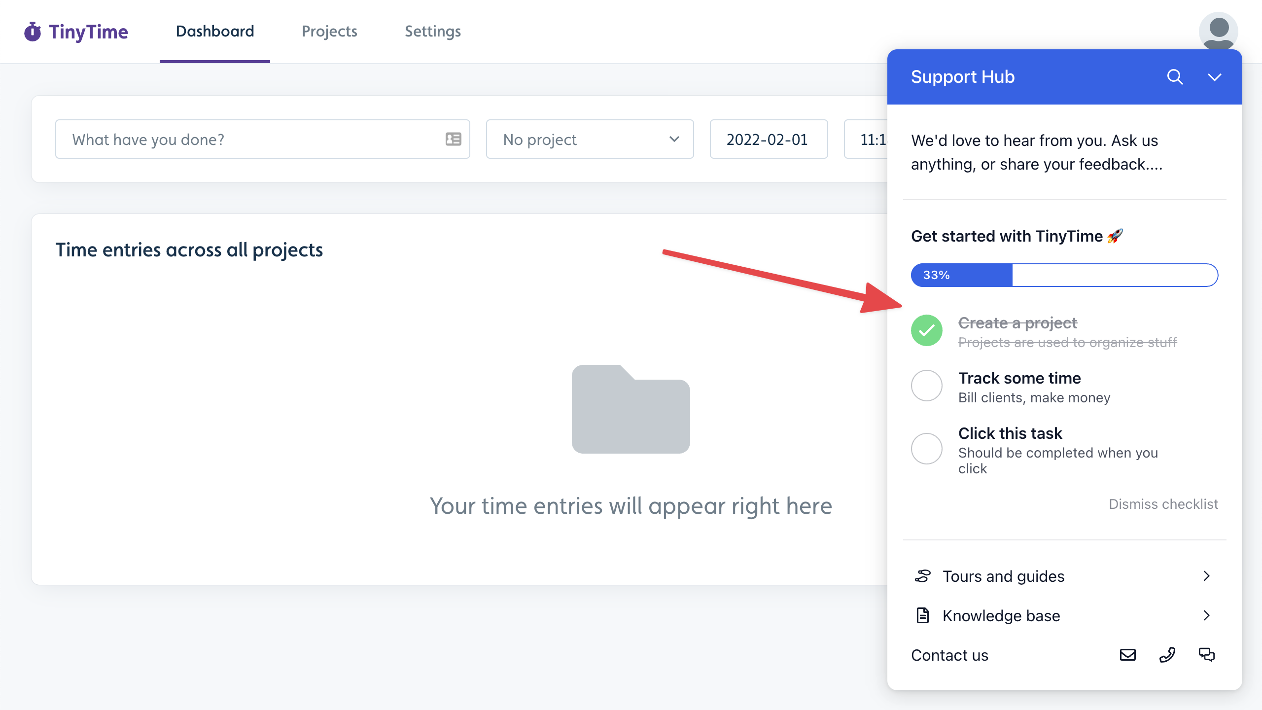
The checklist’s text and number of tasks not yet completed (if any) will also show in the Resource Center launcher.
If you don’t include a checklist block in your Resource Center, the checklist will work stand-alone and be displayed next to your Resource Center by default. You can also embed checklists in your app to provide a different on-brand experience for your users.
List of flows/checklists block
The List of flows/checklists block enables your users to find and start flows and checklists on demand. When users click it, it will show a searchable list of flows.
If you click the block in the builder, you can edit its icon and name, and select which content items will be listed.
.png)
Note: Flows/Checklists are not included by default in this block. You must add each individual item you want to list. This avoids the possibility of exposing restricted content inadvertently.
You can either sort the list alphabetically or switch from Sort alphabetically to Sort manually and drag and drop items to reorder.
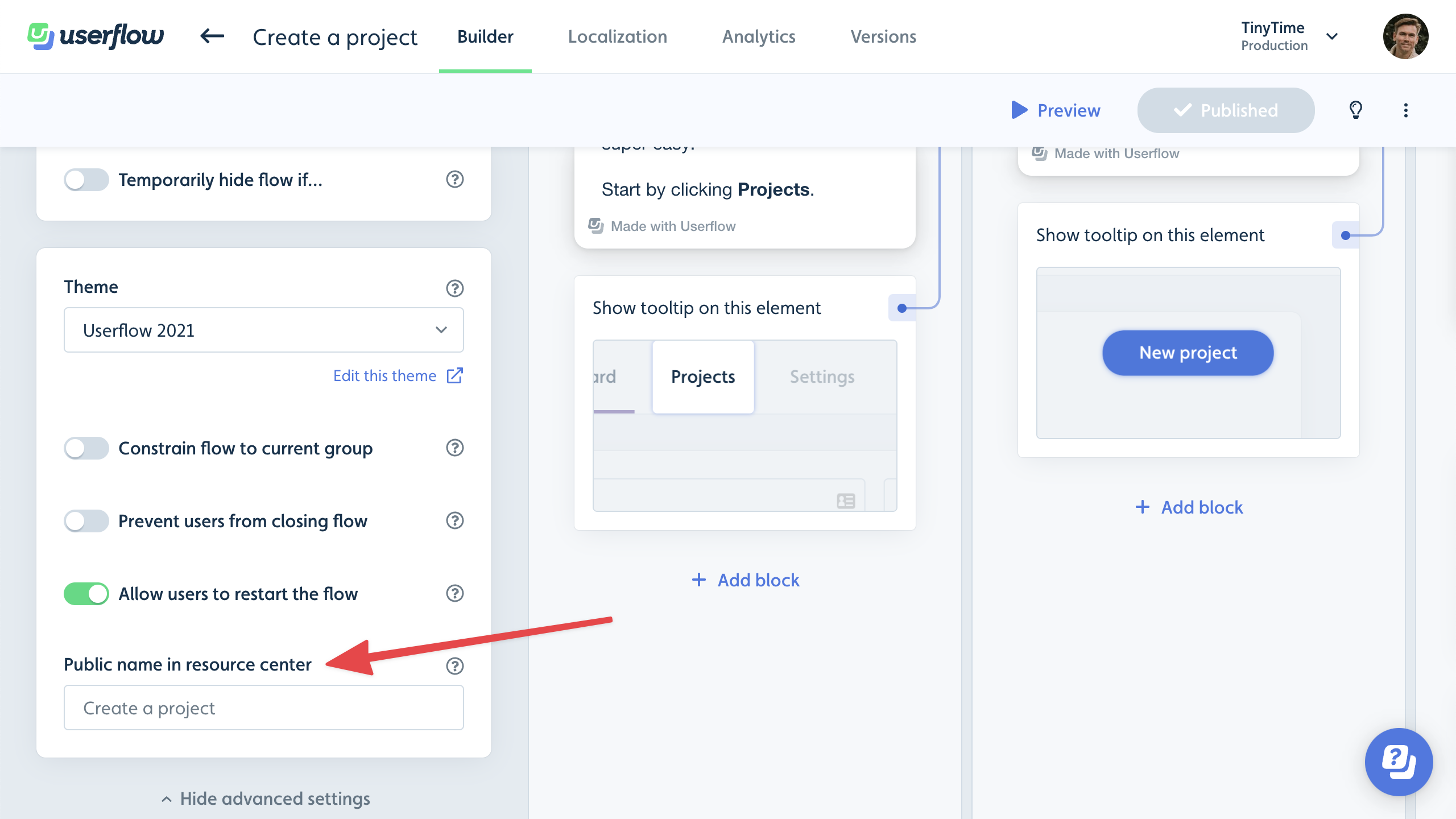
You can optionally override the public names of items in the Resource Center. Open an item’s builder, click Show advanced settings, and look for Public name in Resource Center. Enter the desired public-facing title.
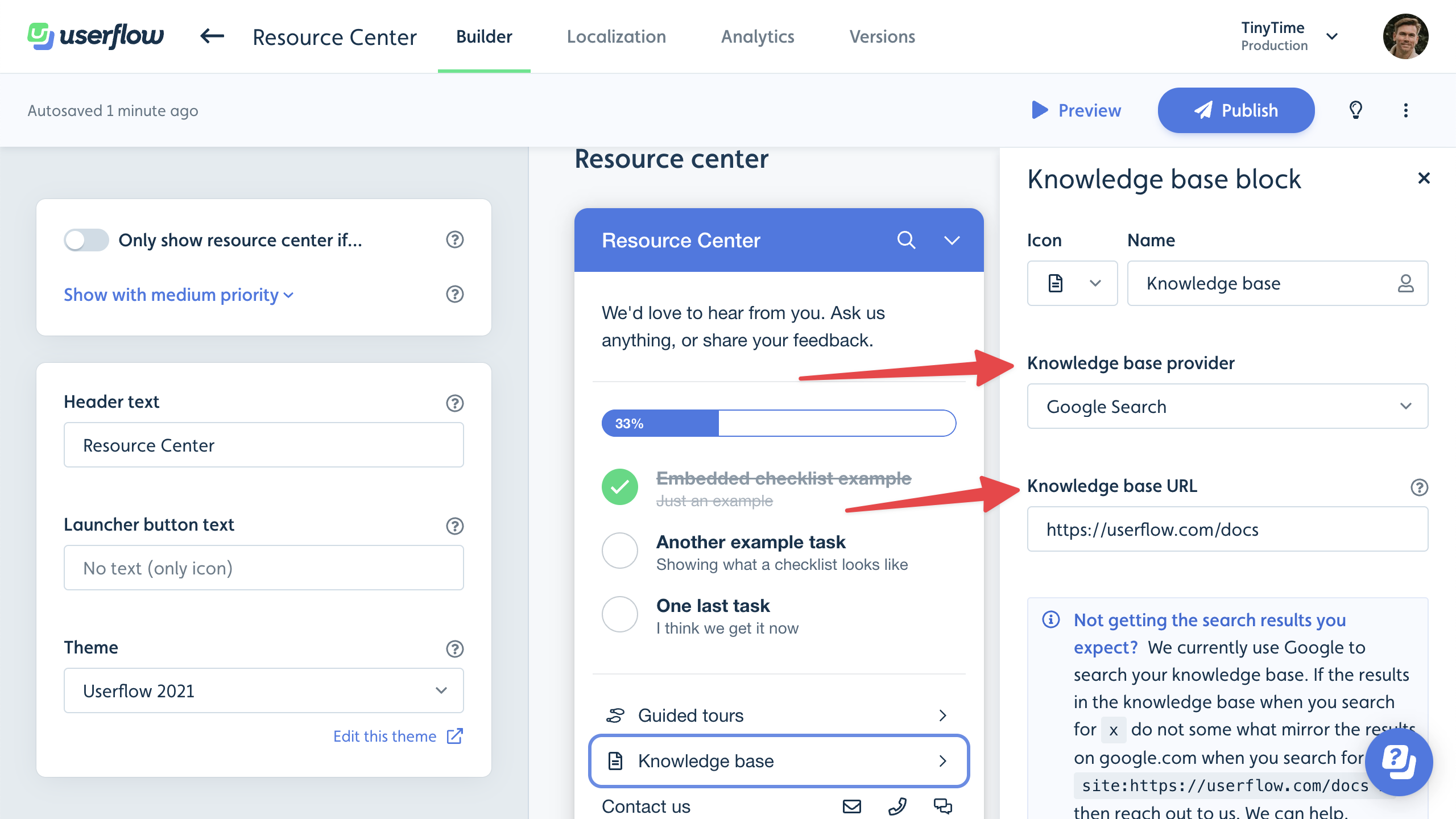
Knowledge base block
The Knowledge base block enables your users to search your existing knowledge base without leaving your app.
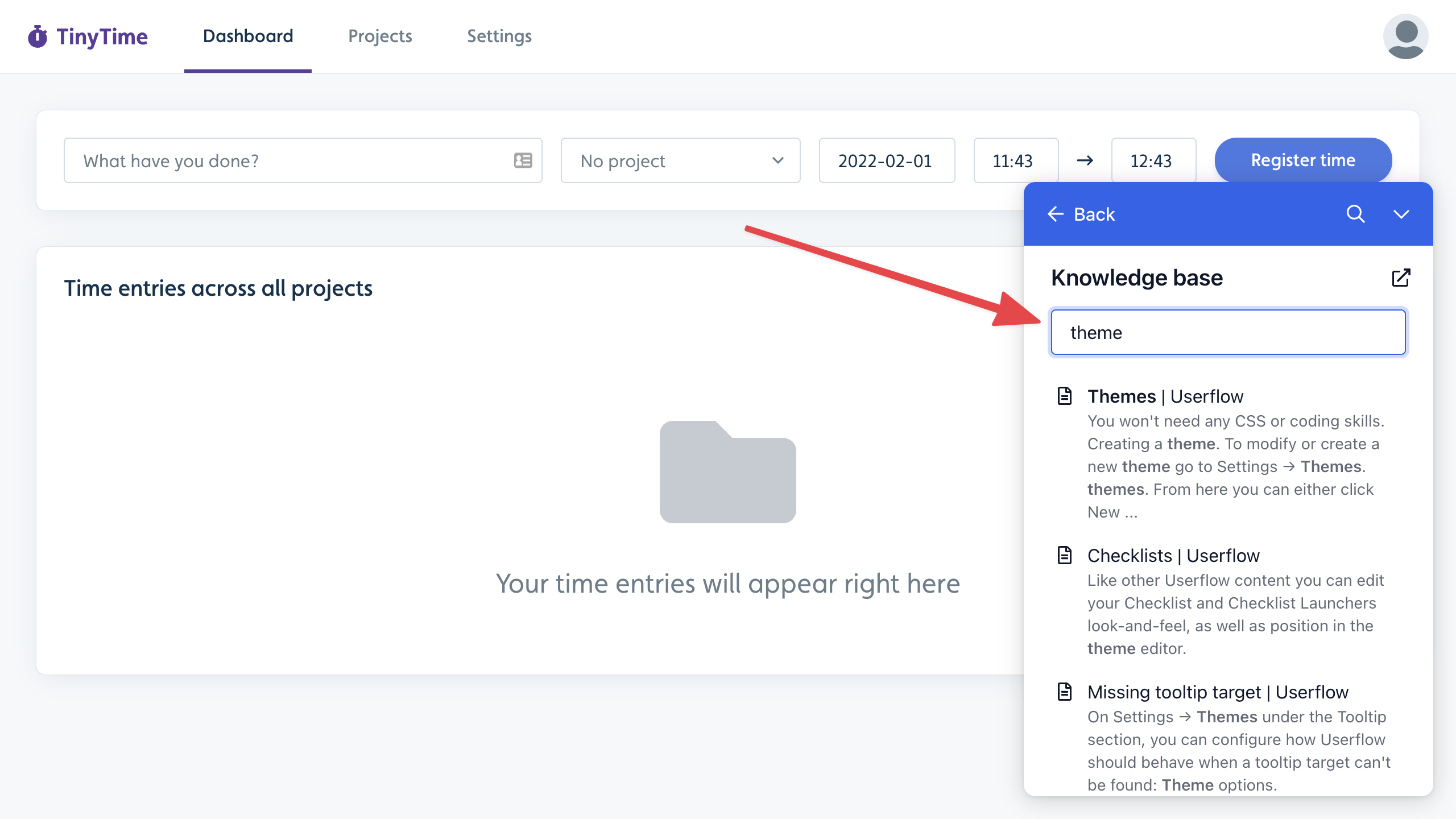
Clicking a search result will open the article in a new tab. There’s also a link button at the top that takes the user to your knowledge base's home page.
We currently support searching directly in the following knowledge base providers:
Public/Unauthenticated search
Freshdesk
HubSpot
Zendesk
Authenticated search
Intercom
Zendesk
For all other knowledge base providers or home-built documentation sites, use one of the following options:
Google Search: Provides similar results to Google.com when searching for
site:yourdomain.com/path. This requires that your site is indexed by Google.Adoption Agent: If you’re using our Adoption Agent, you can utilize its sources for searching. This requires that your assistant is trained and published. You do not have to use the assistant for AI chat, so if all you want is a knowledge base search, you can also use the assistant like this. Searching via the assistant incurs no additional cost. Using the Adoption Agent as a source also lets you perform authenticated searches in Salesforce knowledge bases.
Choose your Knowledge base provider and Knowledge base URL in the builder’s side panel.
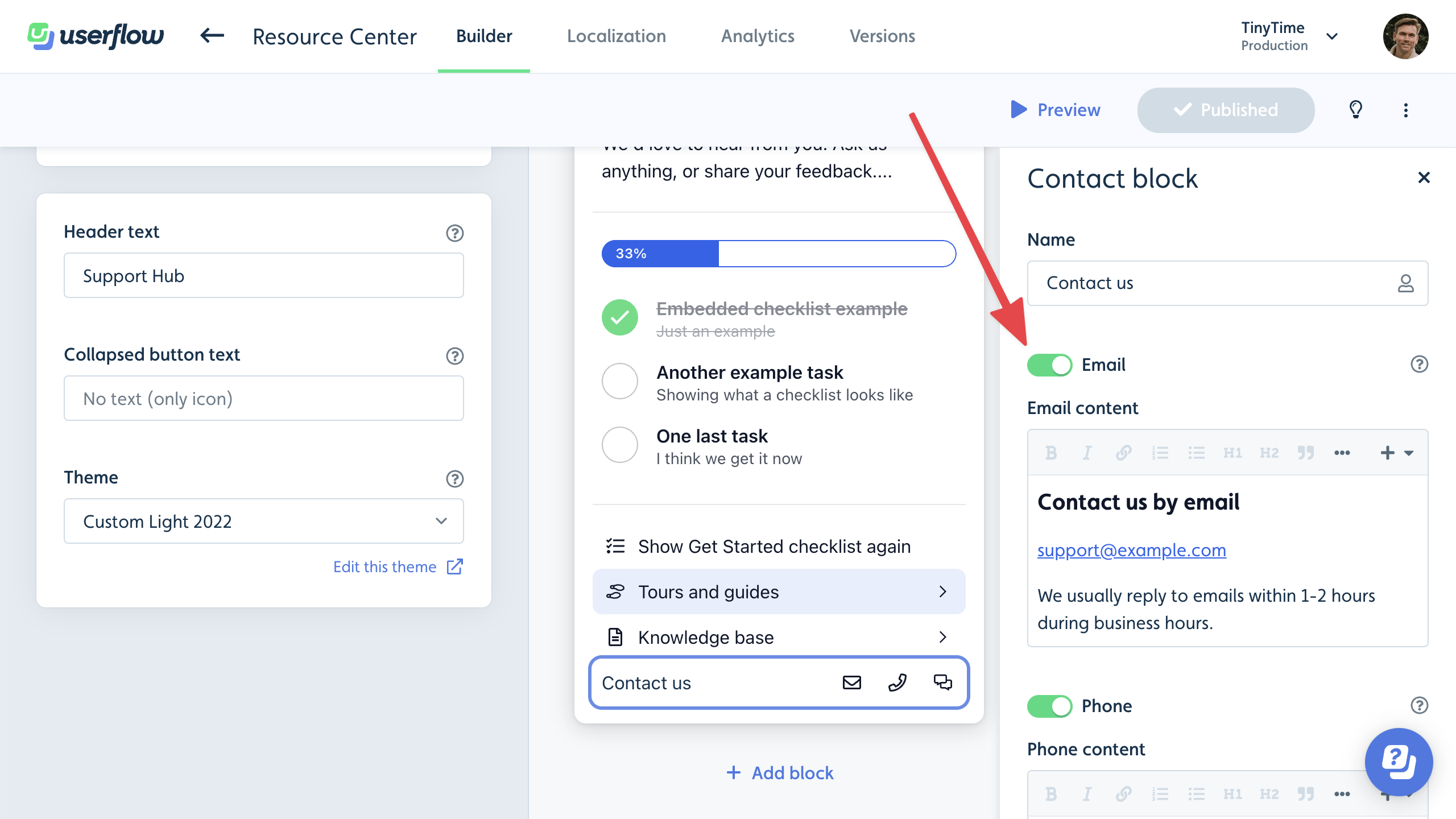
Contact block
We recommend putting a Contact block at the bottom of your Resource Center. It’s a great way to connect users with your support team.
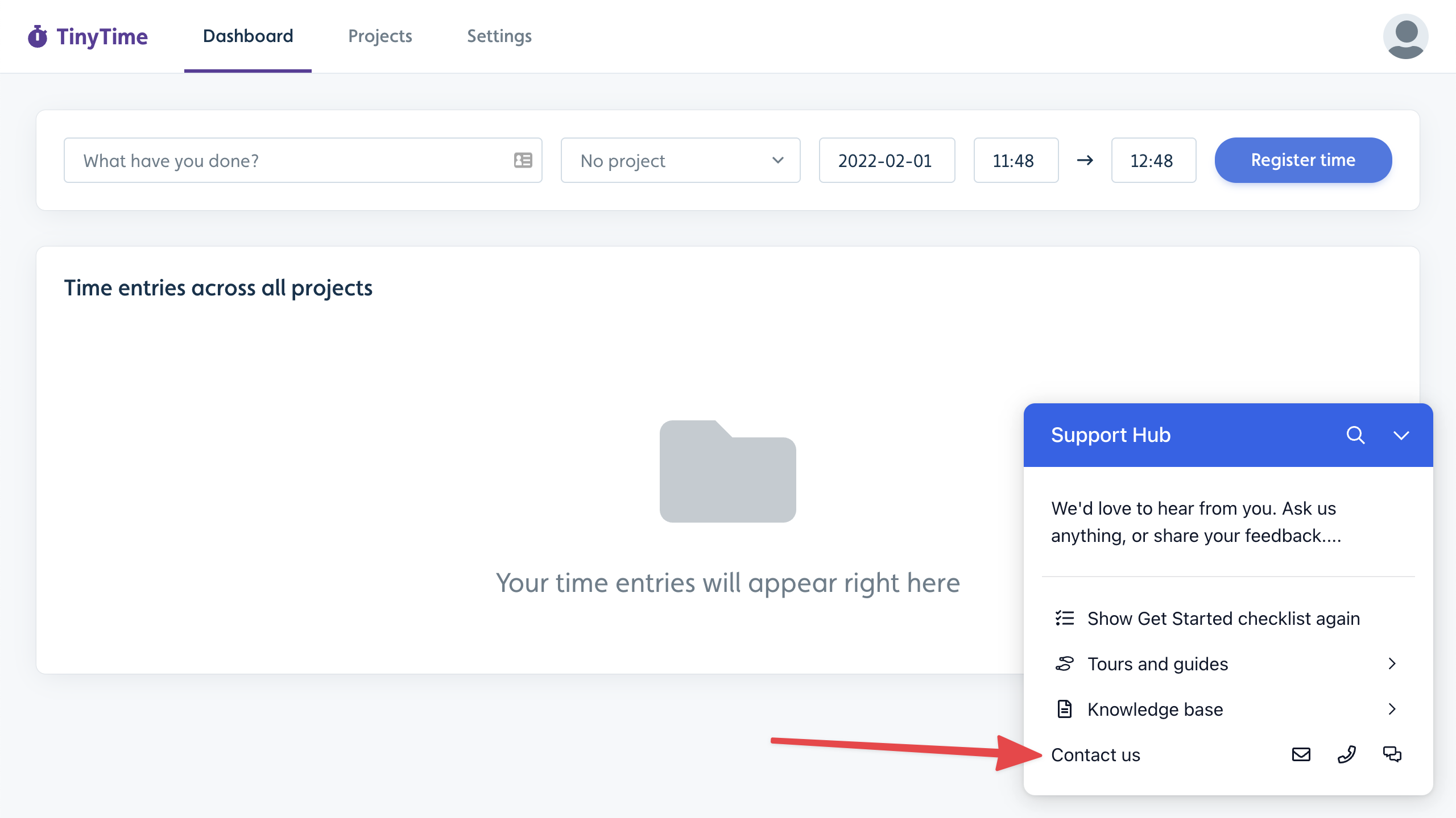
When users click the Email or Phone icon, they’ll see a page with information, for example, your support email address:
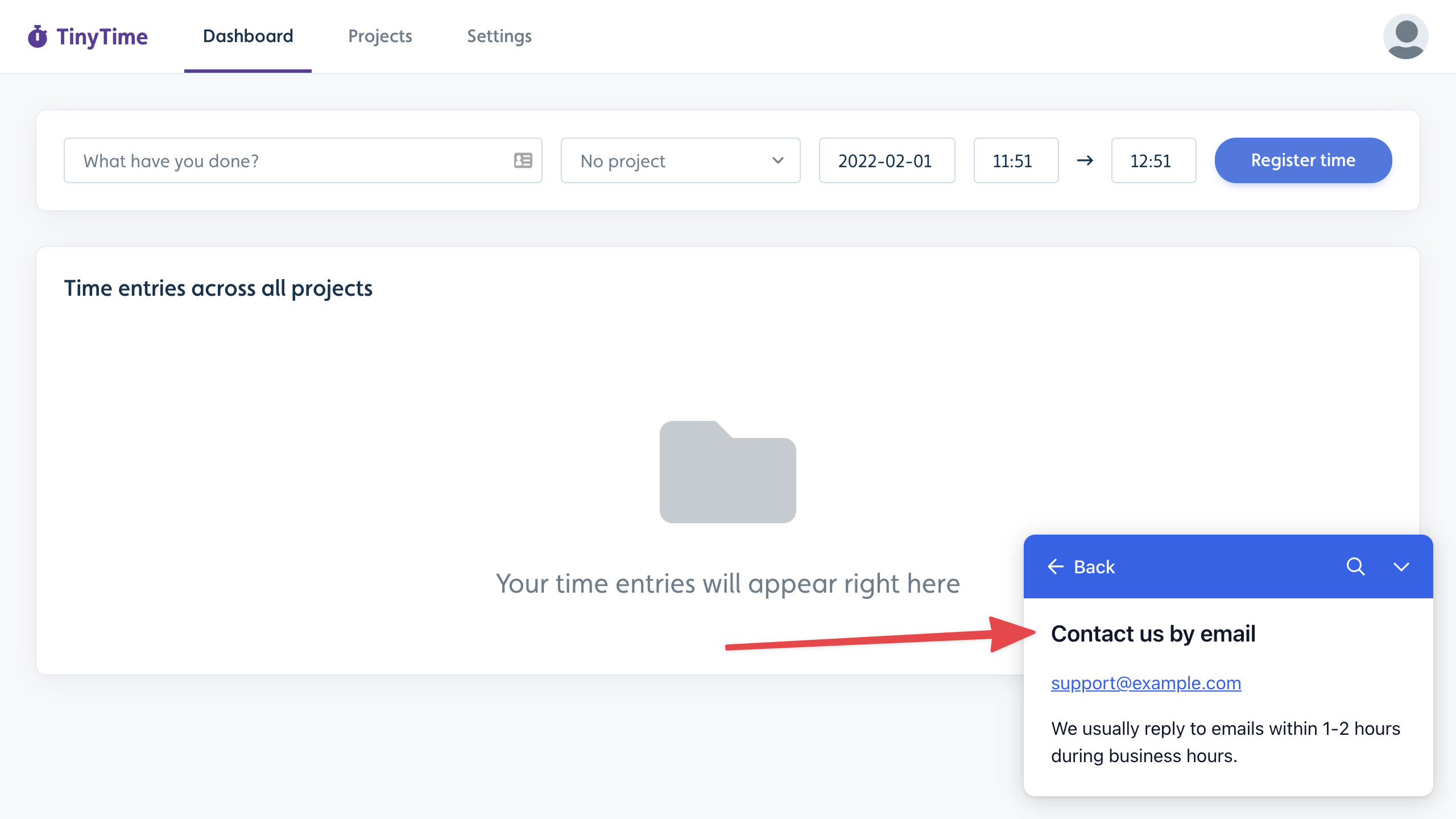
When they click on the Chat icon, the Resource Center will close, and your live-chat provider will be activated:
Click the Contact block in the Resource Center builder to customize which of the Email, Phone, and Chat options are displayed, edit the text, and choose your live-chat provider.
The Resource Center currently integrates with the following live-chat provider options:
Crisp
Freshchat
Help Scout
HubSpot
Intercom
Zendesk
For all other chat providers, you can build a custom chat connection using JavaScript.
Action block
Action blocks are ideal for any custom action you want users to perform in the Resource Center. It works similarly to a button in a flow. The block’s actions will be executed when a user clicks it.
You can use an Action block to navigate the user to a page, start a specific flow/checklist, or execute custom JavaScript that performs any necessary task.
.png)
Message block
If you want to display a free-form message, such as an announcement or a greeting, in your Resource Center, then the Message block is for you.
.png)
Sub-page block
If you want to display a larger free-form message, such as a list of resources or an embedded video, in your Resource Center, then use a Sub-page block.
.png)
When the user clicks the block, the Sub-page content will be displayed in a nested route with a Back button.
.png)
Announcements block
Announcements in Userflow let you update users about new features, fixes, events, and more, all within the Resource Center.
Read more in the Announcements guide.
Adoption Agent block
Adoption Agent delivers automated answers to your users’ questions within your app, leveraging your knowledge base and website, and powered by OpenAI’s GPT-4o.
Read more in the Adoption Agent guide.
Conditionally display a block
You can make a block appear only when a condition is met by using the Only show block setting.
A good example is if you have an Action block that (re)starts a checklist, then it’s a good idea to only make it show up if the checklist is not already active:
.png)
Another example is to conditionally show help articles on specific pages:
.png)
Example: Show a CTA to trial users only
You can use attribute targeting to show different content based on a user's subscription status. For example, to display a "Talk to an Expert" button only to users currently on a free trial:
Add an Action block to your Resource Center. Label it "Talk to an Expert" and configure its action (for example, open a booking link or start a live chat session).
In the block settings, enable Only show block if.
Add a condition targeting your trial attribute — for example,
plan_type = "trial"oris_trialing = true. Use whatever attribute your team sends to Userflow to identify trial users.Save and publish.
Users on a paid plan see your standard Resource Center. Trial users also see the "Talk to an Expert" block. The same pattern works for upgrade prompts, role-specific help content, or any experience you want to personalize by user segment.
Conditionally show the Resource Center
To conditionally show or hide the Resource Center, toggle Only show resource center if conditions. For example, this can be used if you only want to display the Resource Center on specific pages, or when particular elements are present or absent. If an element blocks the Resource Center, it is often better to adjust the Resource Center's z-index (via theme settings).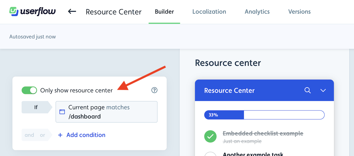
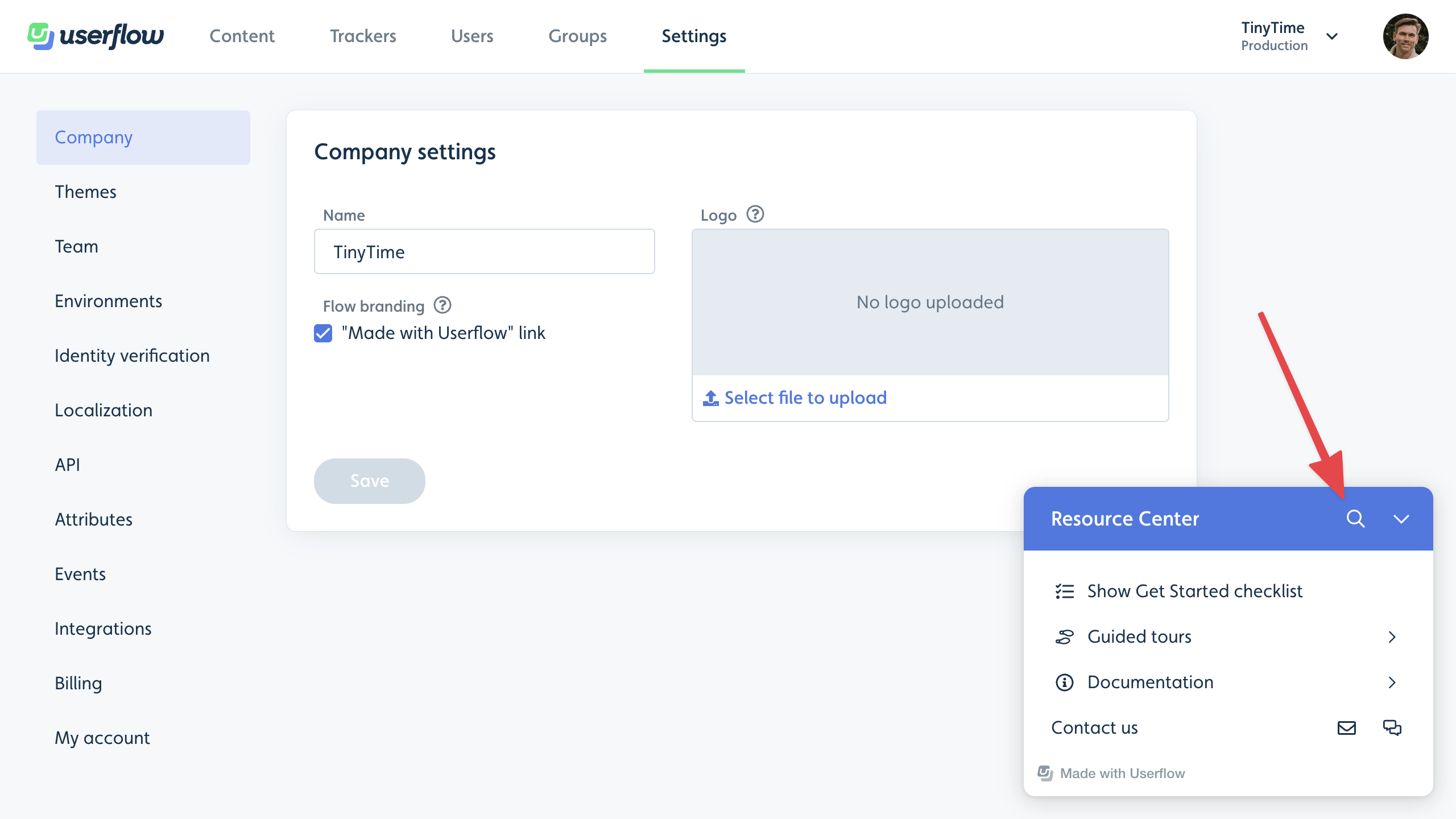
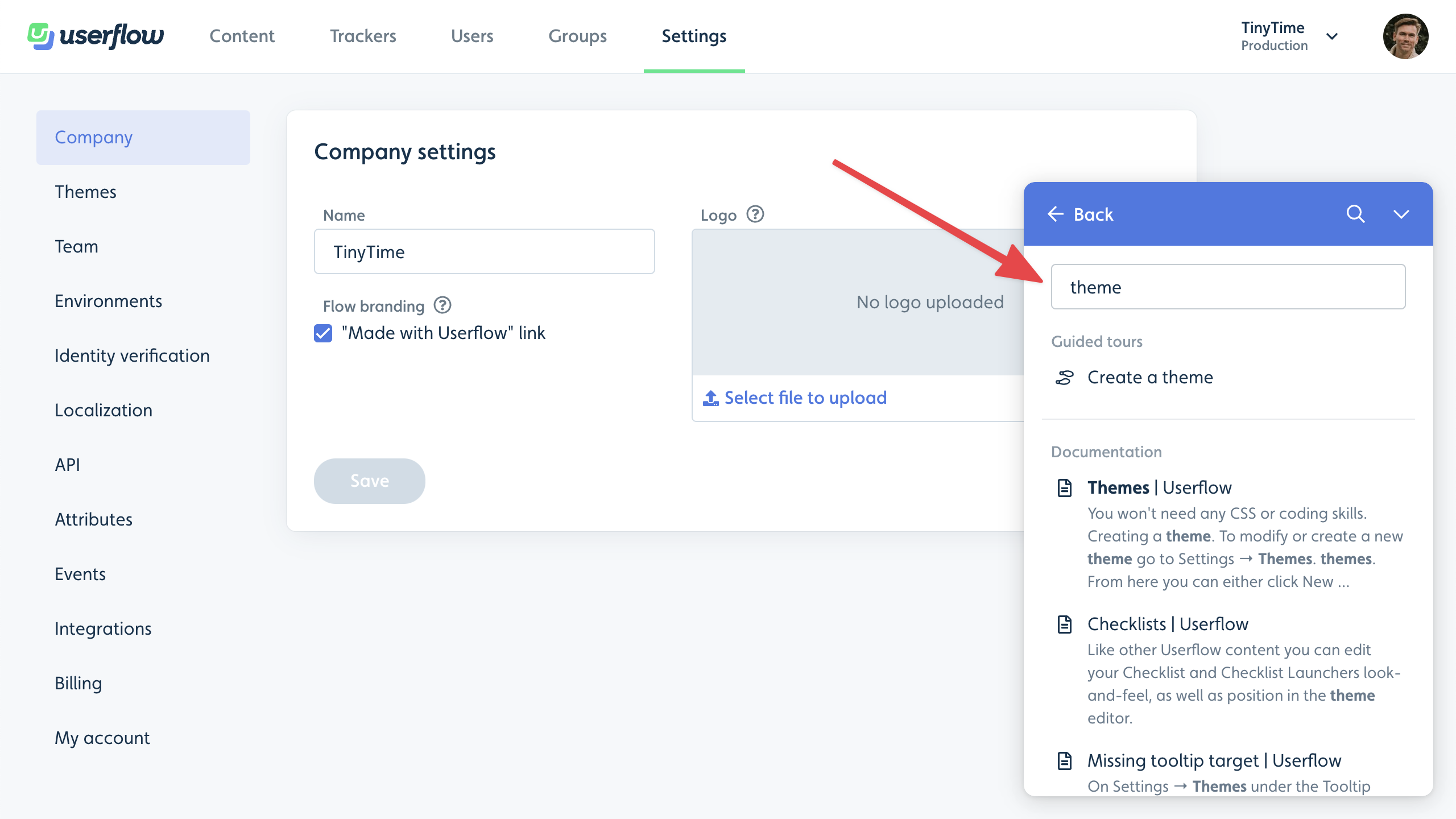
Global search
If your resource center has at least one searchable block (currently, only Knowledge base and List of flows/checklists blocks are searchable), a global search icon will appear in the header:
Clicking it and searching will search across both flows in your Userflow account and articles in your knowledge base:
Theming
Under Settings > Theme, you can customize the look of your resource center.
Use the Base colors section to quickly adjust the colors. Read more in our Themes guide.
Use the Resource Center section to control where the resource center appears, as well as its size and padding. You can also change the resource center launcher appearance, for example, if it should have the default icon or a plain text question mark, as well as if it should show the active checklist text, the resource center launcher text, or no text at all.
Dividers and badge appearance
Dividers between blocks. By default the Resource Center auto-inserts divider lines between your blocks. If you'd rather place dividers yourself — for example to group related blocks or remove separators entirely — go to Settings → Theme → Resource Center and toggle manually inserted divider lines instead of the default auto-inserted ones. See Customizing Themes for the full Resource Center theme options (position, size, padding, colors).
Unread count badge. The red unread badge appears automatically wherever your launcher lives:
Default launcher — on the button.
Custom launcher — attached to the corner of your chosen element.
None — hidden (no anchor to attach to).
The badge's colors are set in Settings → Theme → Resource Center, under Unread announcements badge — you can change both the background color and the text color there. To hide the badge entirely, hide the launcher with userflow.setResourceCenterLauncherHidden(true) — note this also hides the launcher itself and floats any boosted announcements with no notch.
Resource Center Best Practices
Use these proven best practices and strategic use cases to help you maximize the impact of your Resource Center. Whether you’re implementing your first help widget or optimizing an existing one, you can create a seamless self-service experience that enhances user satisfaction and drives product adoption.
Essential Elements
Checklists: Drive user progress with visual milestones that create a sense of achievement.
Contact options: Provide clear escalation paths when users need human help.
Smart visibility: Show the right resources to the right users at the right time using conditional display.
Role-based centers: Deliver personalized experiences by creating separate centers for different user segments.
Brand consistency: Match your app's look and feel effortlessly with configurable themes.
Self-Service Support
Knowledge base search: Users find answers without leaving your app.
Adoption Agent: Instant, automated answers powered by your documentation and latest LLMs.
Multi-channel escalation: Seamless handoff to live chat (Crisp, Freshdesk, Help Scout, HubSpot, Intercom, Zendesk).
User Activation & Adoption
Progressive onboarding: Guide new users through setup with checklist-driven milestones.
Feature discovery: On-demand tutorials help users unlock product capabilities.
Announcements: Keep users informed about updates, fixes, and events.
Troubleshooting
If your Resource Center isn't working as expected, check these common issues:
Resource Center not appearing
Check installation: Make sure Userflow.js is installed and userflow.identify() has been called.
Check launcher settings: Verify your launcher type (Default, Custom, or None) is configured correctly in Settings → Resource Center → Launcher.
Check targeting rules: Go to your Resource Center settings and review "Only show resource center if" conditions. Make sure the current user matches those rules.
Custom launcher not working
Element not found: Open the browser Console and run document.querySelector('YOUR_SELECTOR'). If it returns null, Userflow can't find it either. Update your selector in the Resource Center settings.
Element loads after Userflow: If your launcher is rendered by React/Vue/Angular after page load, call userflow.updateResourceCenter() after the element appears.
Works in staging but not production
Check environment token: Make sure your production site uses your production Userflow token, not your staging token.
Check publish status: Verify the Resource Center is published to your production environment in Settings → Environments.
Resource Center is empty
No content published: Publish at least one Resource Center item (Announcement, Checklist, or link) and confirm its audience settings match the current user.
Still not working?
Check the Userflow Debugger or contact support at support@userflow.com with your browser type, environment, and Userflow environment ID.
Advanced Customization
Custom workflows: Trigger actions, navigate to key pages, or execute JavaScript.
Dynamic content: Deliver messages, videos, and sub-pages based on user context.
Segmented experiences: Tailor content by subscription tier, product area, or user behavior.
Measure & Optimize
Track engagement: Identify your most valuable content through interaction analytics.
Test configurations: A/B test layouts and content to maximize user satisfaction.
Refine targeting: Use behavioral data to surface the most relevant resources.